
 Serge Dobrorez
Clients are terrible at briefs — so I built Tinder for design
Every project at the studio starts the same way. The client says something like: "we want it modern, but with character," "premium, but not boring," "I'll know it when I see it." And then comes the stage I quietly call the guessing game: we prepare three directions, export them, lovingly name the files final_v2, and wait.
47 revisions later everyone's exhausted, and nothing's approved.
The problem isn't that the client "doesn't know what they want." The problem is that a brief in words is a bad language for visual taste. People are terrible at describing aesthetics in text. But they're brilliant at instantly saying "oh, that — yes" or "ugh, no" the moment they see a specific picture.
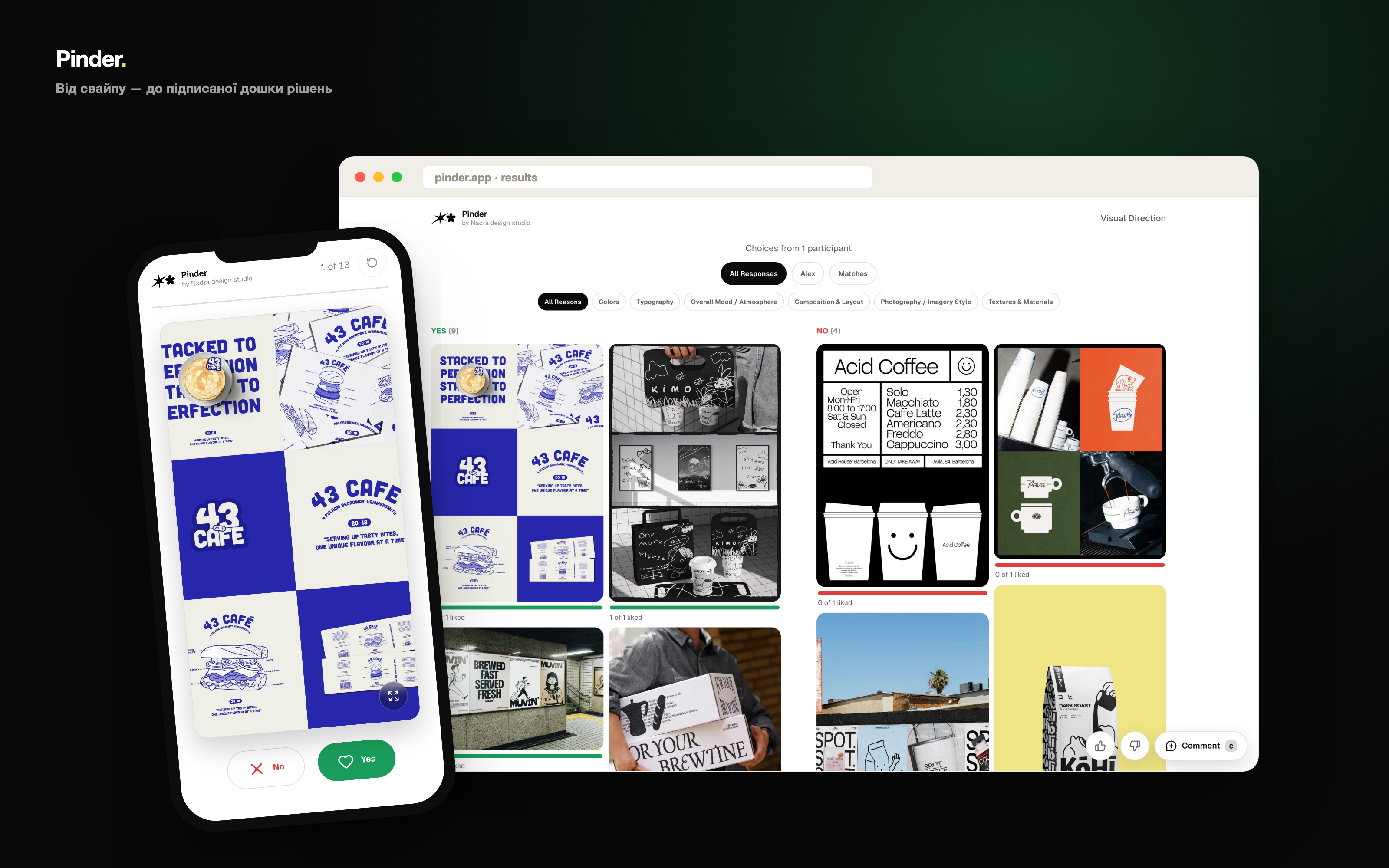
That's how Pinder was born — a swipe-to-decide tool for visual taste. Instead of describing taste in words, the client simply flips through a set of references one by one, Tinder-style — yes or no. And the studio gets, not a contradictory brief, but a clean board of shared preferences.
Pinterest × Tinder × Finder = Pinder.
How the idea was born
One evening I caught myself thinking: we already have the perfect interface for this. People swipe in Tinder every day and make gut decisions in half a second. What if choosing a visual direction felt as easy as meeting someone?
The key is focus. When there's one image filling the screen instead of a moodboard of forty, you react on instinct, not "diplomatically." There's no room for "well, it depends." There's only the first impression — and that's exactly what you need.
Swiping one reference at a time
The client opens a private link, enters their name — and starts flipping. One reference at a time. Right or the green button — like; left or red — no. It works with swipes, buttons and arrow keys; there's undo if you change your mind; progress restores if you close the tab.
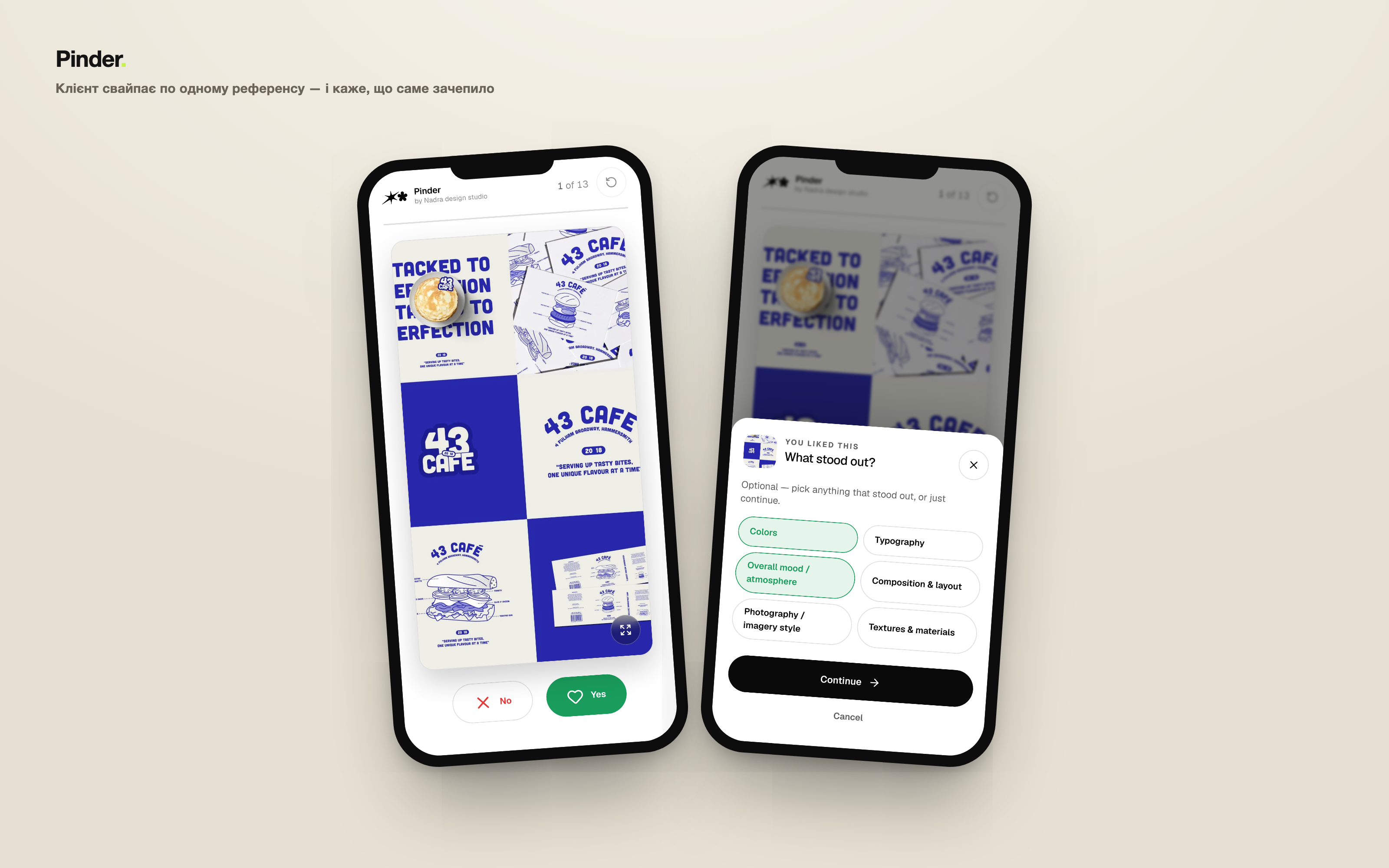
"What caught you?" — reasons after every yes
Saying "I like it" isn't enough. After every Yes, Pinder asks what exactly worked: colour, typography, mood, composition, photography, texture. It turns intuition into data. By the end of a session you see not just which references won, but why — and that's already a shared language for talking about direction. The step is optional, and the studio edits the list of reasons per session.
A shared decision board
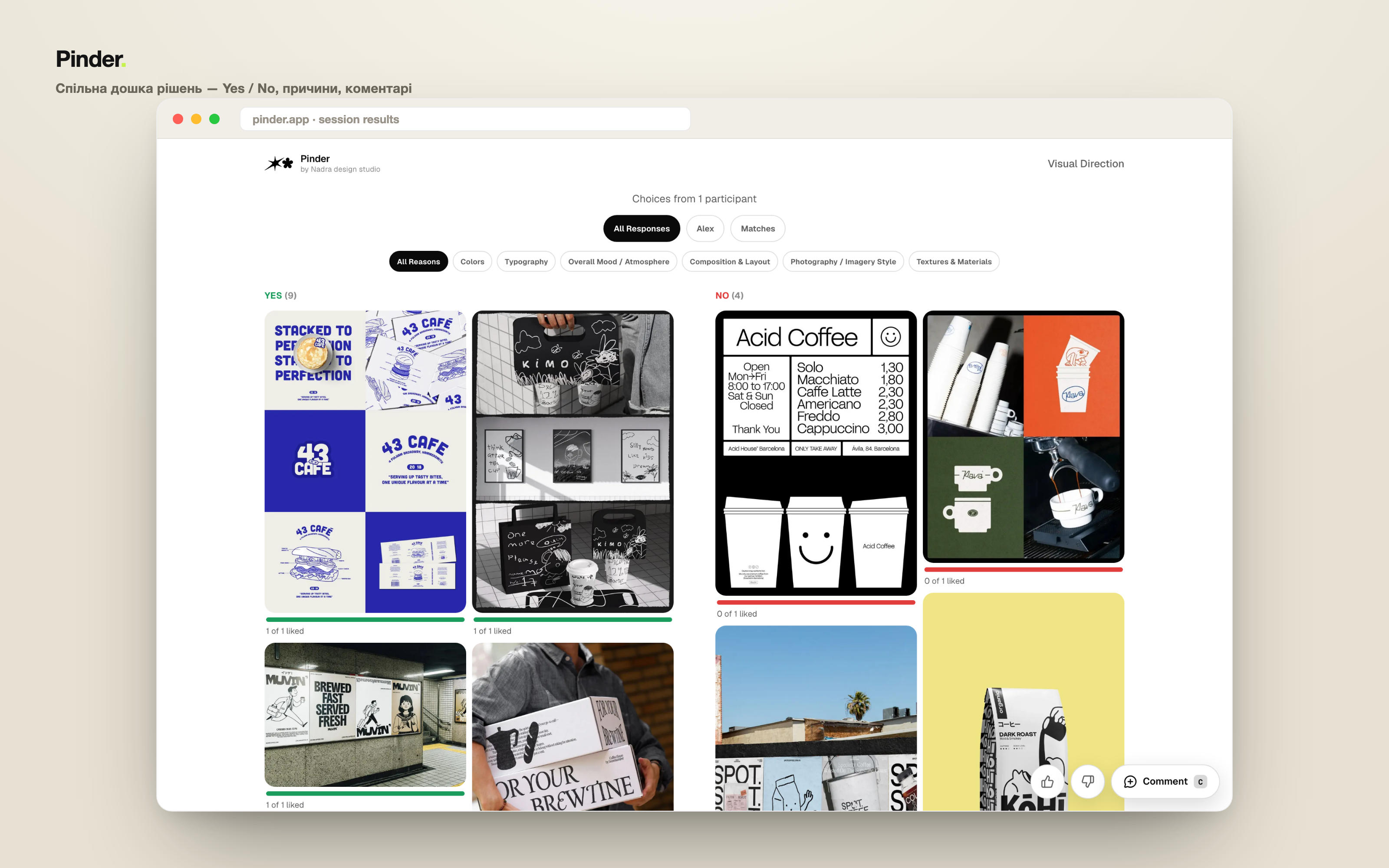
When everyone's done swiping — the results board appears. Two columns: Yes on the left, No on the right. You can filter by each participant, view only "Matches" where everyone agreed, filter by reason, count votes. Click for a lightbox, and leave Figma-style comments and 👍 / 👎 stickers over the images.
That's the "signed board": instead of "I thought you said you liked minimalism" — concrete, recorded decisions everyone can see.
The studio side
On the studio side, everything lives in a password-protected admin. You create a session, drag in images (drag-and-drop, reorder, delete) — or pull them straight from a Pinterest board. You edit the list of reasons, hit "Start" — and instantly get a link for the client. Plus a public results link with no login, a "Finish" button, and a danger zone for restarting or deleting.
Visually the tool is deliberately quiet: cream paper, graphite text, and green / red only as a Yes / No signal — no extra brand colour, so nothing gets in the way of reacting to the references themselves.
Under the hood
Pinder is built on Next.js (App Router) with TypeScript and Tailwind, animated with Motion. Data lives in Supabase (Postgres + Storage); without keys the app falls back to in-memory storage, so the demo works offline too. Hosting is Vercel with auto-deploy from git. Large photos are compressed right in the browser so they don't hit limits.
What it changed
The best thing about Pinder is that the "guessing game" disappears before the first mockup. In 5 minutes of swiping a client gives more signal than in an hour-long meeting. The conversation about direction starts not from a blank page, but from a shared board where you can already see what resonates — and, just as importantly, what definitely doesn't.
It also turned out to be simply pleasant. People have exactly zero patience for briefs — but they'll swipe for as long as you like.
Sometimes the best solution isn't writing another brief — it's letting someone swipe.