
 Serge Dobrorez
I stopped designing everything in Figma
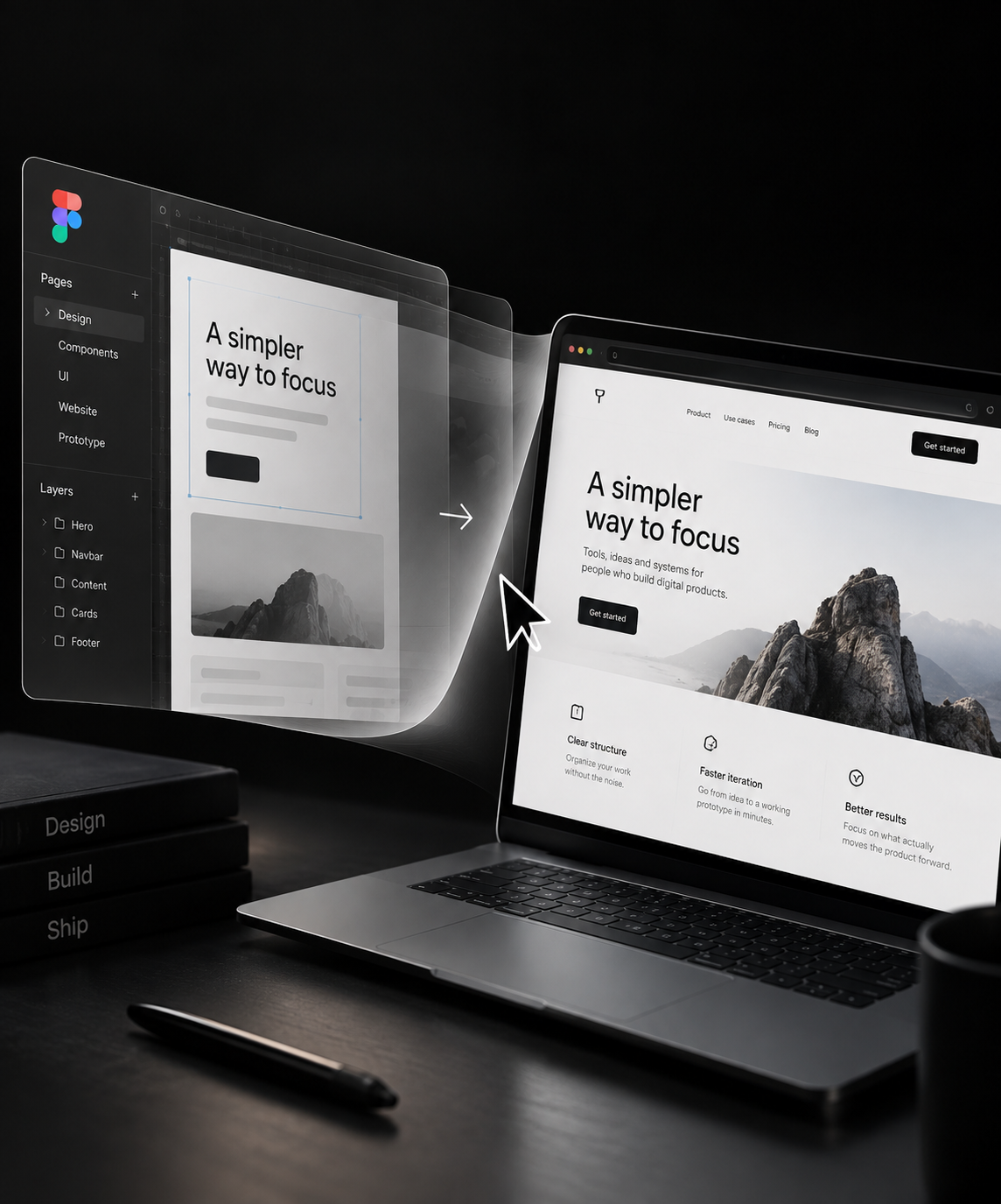
For years, almost all of my design work lived in Figma.
I explored ideas, built components, connected screens into prototypes, polished interactions, and handed everything to developers.
It worked. It still does.
But at some point I realized I was spending a lot of time designing an approximation of the thing I actually wanted to design.
A website isn't a Figma frame. A product isn't a collection of screens.
Real interfaces have viewports. Text wraps. Content changes. Layouts break. Things scroll. Animations have timing and weight. Sometimes something that looks perfect in Figma simply feels wrong in a browser.
So I started moving into the browser much earlier.
It started with small things
At first, I just wanted to test things that were annoying to prototype in Figma: scroll behavior, responsive layouts, menu transitions, specific interactions.
Instead of spending an hour building a prototype, I'd describe what I wanted to an AI coding agent and make a simple HTML version.
HTML. CSS. JavaScript. Open. Click. Feel.
I could resize the window, use real content, see what happens when a title wraps to three lines, break something, fix it, and test again.
The feedback loop became much shorter.
The browser became another design surface
I still use Figma every day. It's excellent for visual exploration, systems, components, information architecture, and comparing ideas side by side.
I just stopped expecting every design decision to be finalized there.
Sometimes I make enough in Figma to understand the direction and then move into the browser.
Not because that's where a developer will eventually implement my design.
Because that's where I continue designing it.
The browser immediately exposes things a perfect 1440px frame doesn't: awkward wrapping, viewport constraints, dropdowns opening in bad places, sticky elements covering content, strange keyboard behavior.
I want to discover those problems before I call the design finished, not after handoff.
AI made the boundary softer
I'm a designer, not a frontend engineer.
A few years ago that created a hard boundary. I could describe an interaction or prototype an approximation, but someone else eventually had to build it before I could really experience it.
AI coding tools softened that boundary.
Now I can describe behavior, get something working, open it and react:
Too slow. Too much movement. This should push the content instead. Mobile feels terrible. Change it.
Then test again.
It's the same iterative process I used to have with Figma frames, except now I'm evaluating behavior instead of screenshots.
My prompts changed too.
Instead of:
Make this button smaller.
I try to explain the decision:
This is a secondary action. It competes with the primary CTA. Reduce its visual weight while keeping a comfortable hit area.
The prompt becomes a small design specification.
Then feedback became the bottleneck
Once I started working this way regularly, I noticed another problem.
I'd open a prototype and see ten tiny issues, then spend time explaining exactly which DOM element I meant.
In the pricing section, second card, the button below the feature list...
The element was literally in front of me.
I tried annotation tools for AI workflows, but eventually built my own small one: Gnom.
I click an element, leave a note, and the agent gets structured context about what I'm pointing at.
Gnom wasn't the reason my workflow changed. It was a consequence of it.
The tool came from the workflow.
Real products pushed it further
This became much more useful on real product work.
On Remedico, a dental practice management platform, I worked with calendars, dental charts, treatment plans, patient records, communication tools, permissions, AI features, and complex clinical workflows.
A static screen tells only part of that story.
A dental chart can look beautiful in a presentation. That doesn't tell you whether selecting several teeth, changing a diagnosis, adding a treatment, undoing an action, and switching patients actually feels good.
I became more interested in testing the system, not the screen.
In some flows, the handoff changed from:
Here's how it should work.
to:
Here's how it works. Let's make it production-ready.
That's a very different conversation.
My own products made the line even blurrier
Scrollcast started from a small personal annoyance: I wanted better-looking recordings of websites and product interfaces.
So I built, used, changed, and rebuilt it.
A little design. A little code. Use it. Notice what's annoying. Change it.
At some point it became difficult to say where design ended and development started.
For this kind of work, I'm not sure that distinction matters much.
The product itself became the design file.
I still use Figma
This isn't a "Figma is dead" article.
Figma is still faster for many things: exploring ten layouts, defining visual language, working on a design system, or communicating an early concept.
The change is simpler:
I stopped expecting one tool to contain the entire design process.
Sometimes it's:
Idea → Figma → Browser → Figma → Browser
Sometimes:
Idea → Browser
The tool matters less than how quickly I can answer:
Does this actually work?
My old process looked neat:
Research → Wireframes → UI → Prototype → Handoff → Implementation → QA
Now it's closer to:
Idea → Figma → Code → Test → Change → Code → Test → Ship
Messier, but closer to how products actually evolve.
The biggest change isn't AI
AI made this workflow possible for me, but AI isn't the interesting part.
The interesting part is how much shorter the distance has become between making a design decision and experiencing its consequence.
"What if this wasn't a modal?"
Five minutes later, I can use the alternative.
"What happens with 40 items?"
I can actually scroll through 40 items.
"This animation should feel heavier."
I can test three versions instead of documenting the idea.
That's the change I care about.
Not generating more UI.
Getting feedback from the actual medium sooner.
I still open Figma every day.
I just open the browser next to it.
And increasingly, that's where the interesting part begins.